


Limbix: SparkRx
What is Limbix?
Limbix is a digital therapeutics startup on a mission to make mental health treatment accessible to young people who need it the most, when they need it the most.
Our diverse team of clinicians, product designers, researchers, and engineers are all focused on one thing: giving all young people access to affordable, effective behavioral health care by giving providers immediate, safe, and evidenced based treatment options they can prescribe to their patients.
My Role
At Limbix teams are organized into product development “pods” comprised of Product Management, Clinical Science, Content Design, Product Design, UX Research, Engineering and Data Analysis team members.
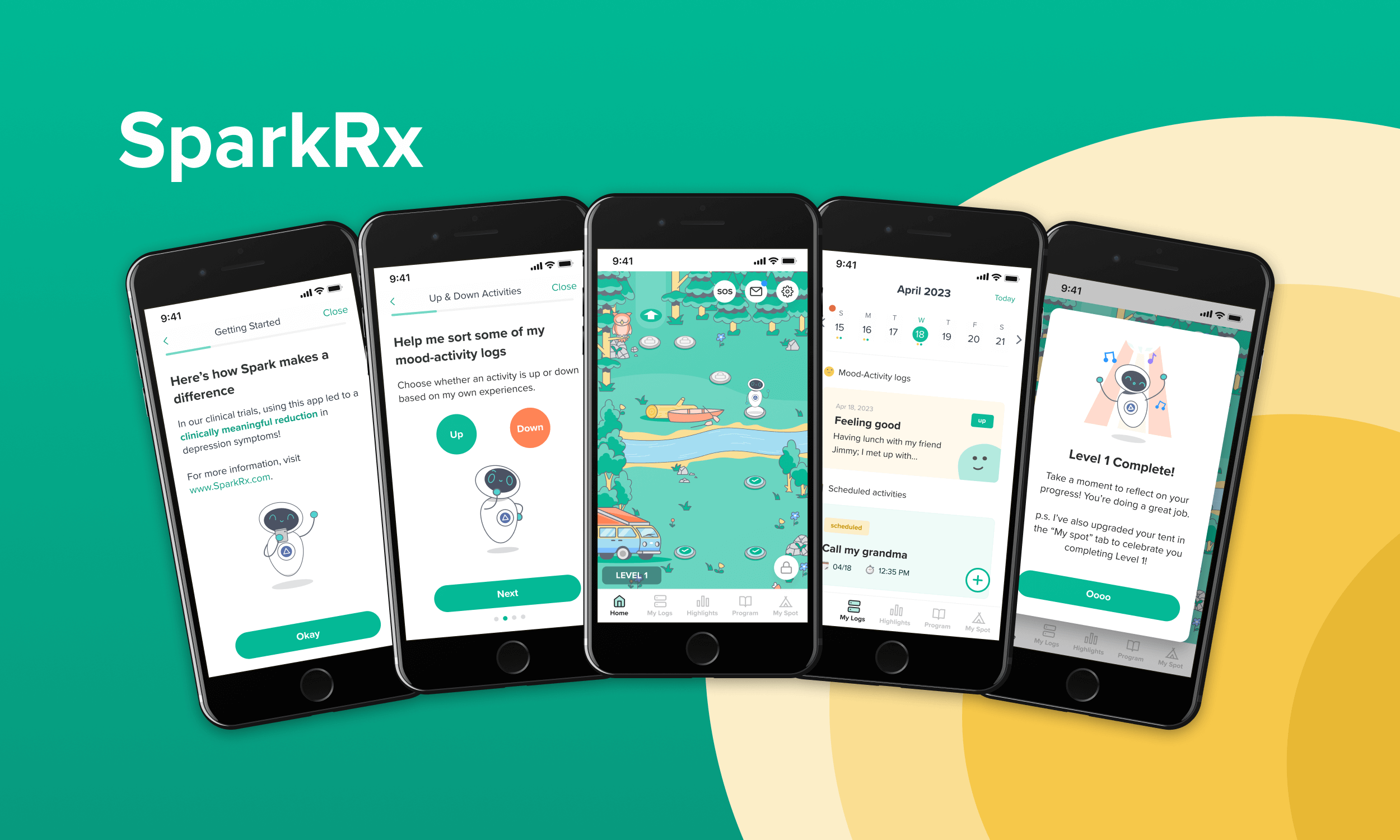
Embedded on the Spark Pod as a Product designer, I produced a redesign of the SparkRx mobile app, Limbix's core digital therapeutic for adolescent depression.
I worked collaboratively with these cross functional partners to realize a narrative and gamification effort aimed at improving patient outcomes through increased engagement.
As a part of that project work, I also led an effort to better codify internal component and illustration libraries in order to achieve tighter Design and Engineering parity using Figma and Storybook.
What is SparkRx?
SparkRx is a digital therapeutic that provides an evidence-based adjunct treatment intervention for adolescents aged 13-22 with symptoms of depression. SparkRx was offered for a limited time, at no cost to patients or providers, under the FDA’s Enforcement Policy during the COVID-19 public health emergency.
Designed with clinical experts in adolescent depression, SparkRx brings evidence-based treatment to each patient’s smartphone, delivering a multi-week program based on cognitive behavioral therapy (CBT) and behavioral activation protocols.
The Challenge

Representative legacy screens
When I joined the pod, SparkRx user engagement wasn’t where we wanted it to be. One major pain point that surfaced repeatedly in user research was a feeling of being “frustrated” or “blocked” by the linear structure of the app, and overwhelmed by the quantity of blocking practice tasks like mood logs and behavioral activations (BAs). Many users said all this added up to the app feeling less engaging and more like “homework.”
We were losing over 50% of users in the first level, and seeing a 25% drop off before finishing the first piece of psycho-ed content. Providers were also telling us that it takes "too long" for users to begin feeling progress, and they would often lose motivation and drop out of the program.
It was clear that improving the early product experience to address some of these concerns presented a big opportunity to increase intrinsic motivation, leading to increased user retention and engagement with the app, and in turn better treatment outcomes.
Solutions
To improve retention, we aimed to create an engaging and positive first experience that increases motivation and belief in the treatment overall.
Many directions were explored during the design sprint process but immediate goals for revamping the overall experience of the app were narrowed down to the following areas:
- Add personalization and treatment goal setting during onboarding
- Add social proof testimonials from past users
- Remove unnecessary tutorial screens to streamline the onboarding process
- Improve comprehension of and connection with the app through the use of a narrative structure
- Gamify the home screen to increase excitement about the Spark journey
Ground Rules
By the time I joined the Spark team, a number of broad directional and tonal decisions had already been made. There was a clear directive that the home screen was to be gamified to make the app more accessible and engaging to an adolescent audience. And the broad theme of a camping / hiking trip had also been established through UX research as something that resonated with our target audience, but many of the specifics beyond that still needed to be explored.
Additionally, it was important that we generally not alter the core clinical content or app structure as doing so would kick off a cumbersome regulatory due diligence process. We would be leaving that as is for the moment and focusing on the UX/UI stitching the clinical content together.
Narrative
Hoping to establish a clear structure to guide the rest of the process, I began roughing out the contours of the narrative. Since the app structure already included 5 distinct levels ideally spread over five weeks of treatment, I began exploring how we might be able to use a 5-act narrative structure as a storytelling device.

This fit quite cleanly, and a simple narrative emerged that saw the user making an introspective journey with their robot guide Limbot to a Meadow, across a river, into a lowland forest, through a cave, and then hiking up to the peak of a mountain, and finally retracing their steps back down the mountain and across the river back to the meadow where their journey began.
Care was also taken to expand and reorder the rewards system as necessary so that there was clearer meaning and/or utility for each reward within the new context of the narrative. A good example of this is the decision to move the canoe reward to the clinical activity just before the user needs to cross the river, so that the reward makes sense in context and propels the narrative forward.
Due to time constraints, the pod decided to put off more in-depth character development and world building for future iterations. With a basic narrative structure in place, we now had a framework to build upon in an ongoing way moving forward.
Level Maps
Next, I worked with our engineers to test out some rough level blocking and work out some of the mechanics of moving sprites around the screen in a predictable way.
There was some initial difficulty getting positioning to work predictably across variable viewport sizes. Specific positions on the level map didn’t always cleanly line up with character or item sprites.
To help better control this, I proposed a responsive grid system in which each cell is a perfect 1:1 square that flexes to fit the viewport. This enables more consistent alignment of elements in relation to a cell and maintains a predictable relative position for all on screen elements as screen size changes.

The layout grid structure
A variable amount of “dead” space occurs naturally above and below the grid on vertically longer screens. This can be filled with additional landscape textures, non-critical landscape elements (bushes, trees, rocks, etc.) or partial “peeks” at other level maps.
This underlying structure allowed engineering to move forward building the scaffolding to support our level maps, and for me to start doing some rough blocking of each level. This work helped provide clarity into how users would move through each level, what sprites might be necessary to fill out the map and informed the specific asks in the illustration spec for sprites from our illustrator.

As the assets began arriving from our illustrator, I was able to begin laying out the final level maps and adding sprites to our growing illustration library. The final level maps ended up looking like this:

Prototype
The clickable prototype below was created to visualize the new overworld gamified view of level 1.
While placeholders are included, specific clinical content has been purposely abbreviated or removed since it is not the focus of this prototype.
SparkRx
Year: 2022 – 2023
Client: Limbix
- Walker Design Did:
- Product
- UX
- UI
- Visuals
- Logo
- Webdev