


Huckleberry Brand Identity
Background
In this first section I provide a little more context about Huckleberry's mission, about my role and then showcase a sampling of some of the elements of the corporate brand identity I created and maintained.
The system and efforts illustrated below formed the visual backbone of the brand, helped launch the product and carry Huckleberry to an $18M Series A.
If you'd rather to skip ahead to a specific section of interest, click any of the links below:

Early days at Huckleberry
What's a Huckleberry?
Huckleberry is on a mission to make insurance work for small businesses. Over the past decade, technology has changed the way we run companies—from accounting and tax prep to customer management and payment processing. But small business owners are still forced to buy workers' comp, general liability, and property insurance via an offline process that can take weeks to complete.
Huckleberry aims to change all that by offering simple, fast business insurance – powered by technology. 100% online. 100% easy.
My Role
I joined Huckleberry as its Senior Product Designer – the very first hire and only designer on the team – when the initial bootstrapped team consisted of our CEO and CTO, adding a VP of Data Science very soon after I joined.
When we were just starting out there was no existing product or branding, and no customer base – just a solid idea and an ambition to disrupt an industry. So, it was my task to build a core brand and product that could serve the company's needs and help carry it to the next level.
I continued to be the only designer on staff for three and a half years until late 2020, spearheading everything from core product UX/UI, to corporate branding, styleguide, illustrations, email campaigns, online marketing deliverables right down to company swag. I also worked closely with the dev team to orchestrate handoffs and even frequently contributed front end code and styling as needed.
Wordmark
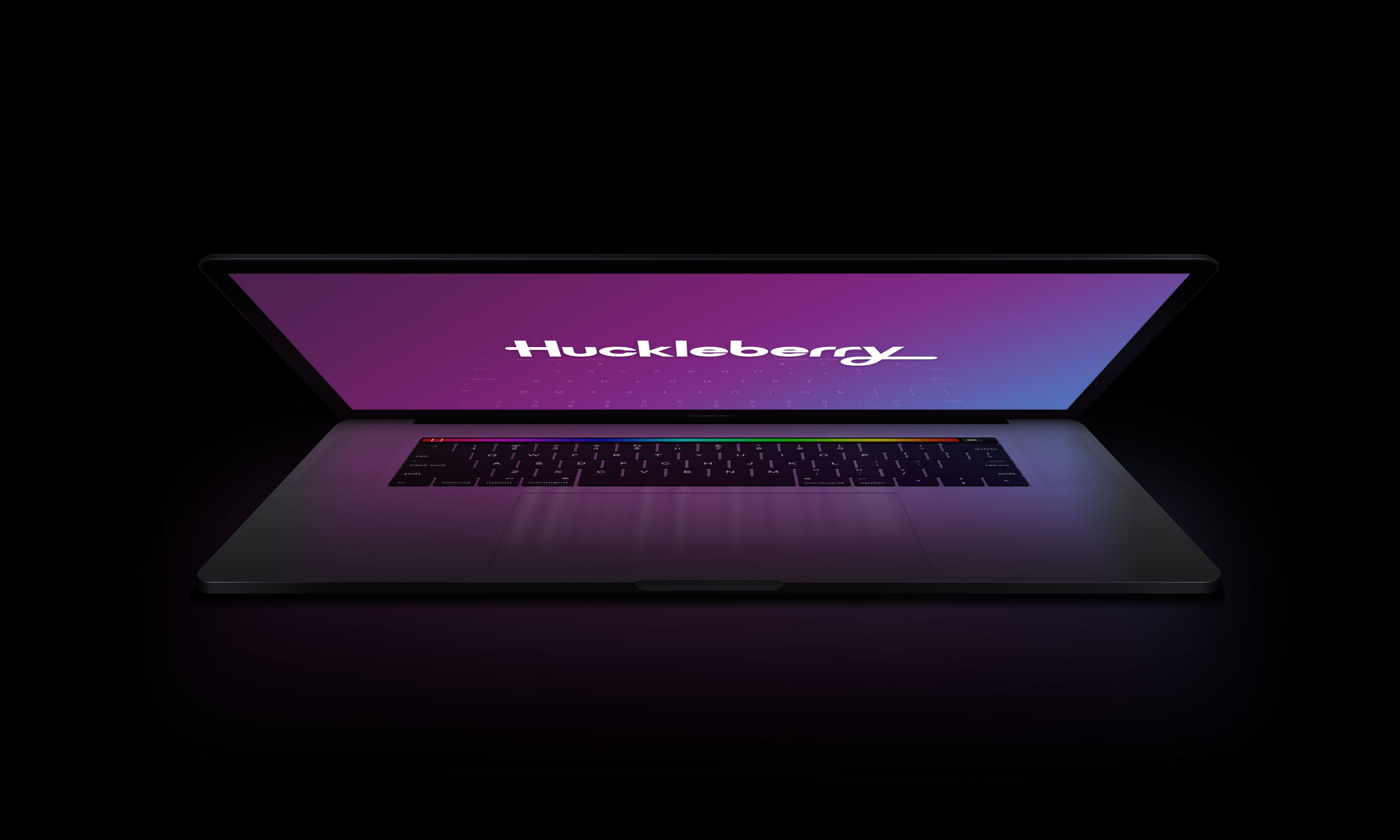
To get us started, one of my first contributions was the Huckleberry Wordmark. Huckleberry has a fully custom sans serif wordmark that's serious but not stogy. The rounded, protruding terminal on the "H" and the looped descender and extended tail of the "Y" create a friendly, playful feeling that contribute to the distinctive visual quality and promote strong brand recognition.

Because of the ascenders, descenders and other protrusions, centering the logotype can be tricky, and 'pixel perfect' centering of the asset on its own usually ends up looking visually awkward or misaligned. To help make centering a little easier, offsets are baked into all wordmark assets along the top and left edges.

Once the wordmark was established I explored a number of different colors and shades before settling on Huckleberry purple as our core brand color

Color Palette
With the core brand color established, I the built an expanded color palette to support the brand both online and in print.
Primary Colors


Secondary Colors


Typefaces
Below are samples of our two main typefaces – Sofia Pro and Europa. The former is used for headings and the latter for body and all other typesettings.
Sofia Pro

Europa

Illustrations
The library of 100+ fully custom illustrations that I designed for Huckleberry continues to grow and represent the brand in various ways both online and in print. Some illustrations communicate broad concepts or represent specific aspects of the product, while others are visual representations of specific industries we serve.

Huckleberry illustration library sample
Huckleberry illustrations are:
- Bold
- Friendly
- Minimal
- Geometric
- Monochromatic
- More round than they are sharp
Animations
I began experimenting with animated versions of some of the exisiting illustrations from the library – as well as some brand new ones – using Lottie and Bodymovin to make animated SVGs for a series of education / messaging interstitials.
The original interstitials have since been retired, but the animations themselves were quite engaging effective. I intend to build out more complex animations and microinteractions for use throughout the Huckleberry product.
Huckleberry Brand Identity
Year: 2017 – Present
Client: Huckleberry
- Walker Design Did:
- Product
- UX
- UI
- Visuals
- Logo
- Webdev
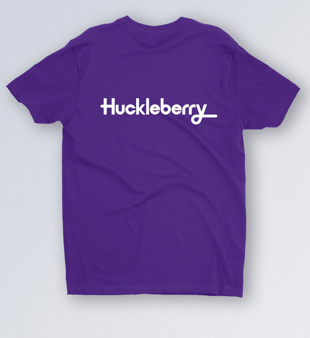
Swag 1: The original Huckleberry t-shirt!
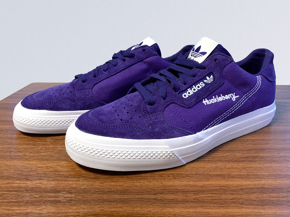
Swag 2: Huckleberry embroidered sneakers!