


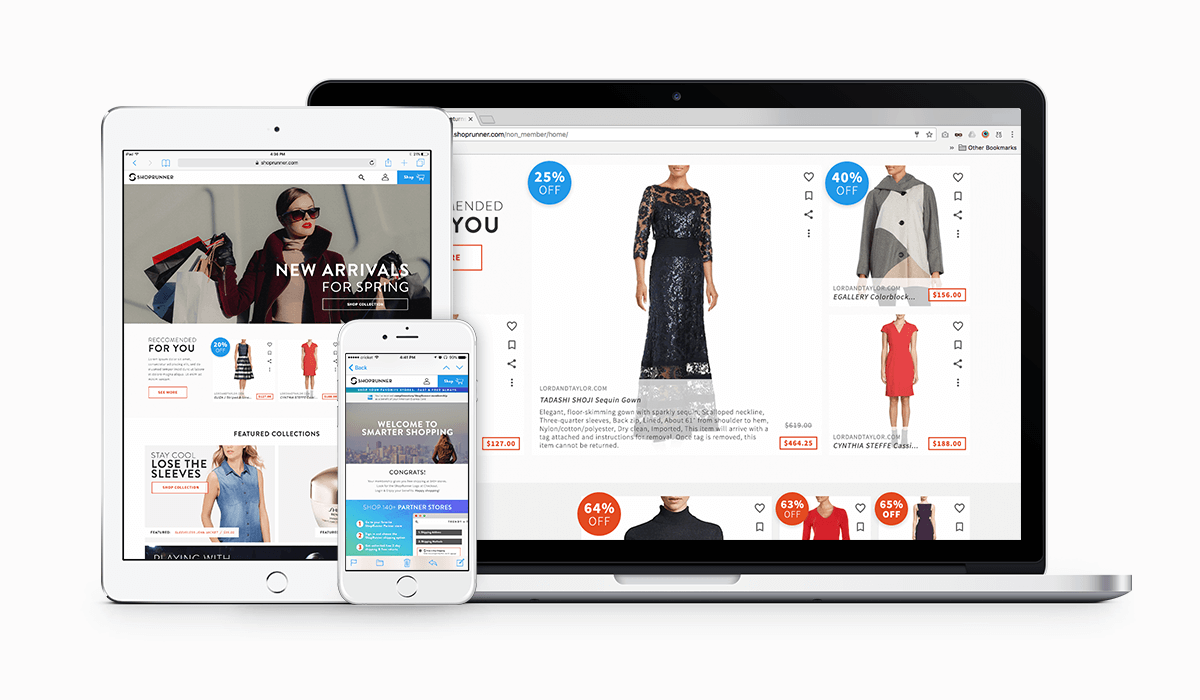
ShopRunner Web Redesign
With Foundation Framework and the global styleguide now firmly in place, it was time for the design team to begin reimagining the look and feel of the ShopRunner online experience. Included below are examples of some of the mockups and ideas I contributed.
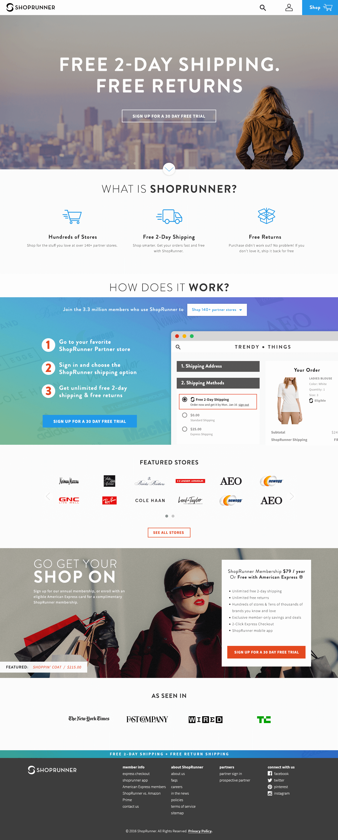
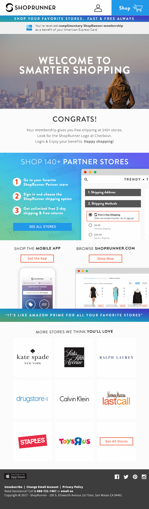
ShopRunner Web Redesign, Non-Member Home Page
Non-Member Home Page
I envisioned a new non-member home page with clearly delineated sections that encourage user education and signups by concisely communicating what ShopRunner is, how it works and offering supporting information on featured partner retailers and links to positive articles in the media.
The clear separation of sections was not simply a visual treatment however. The intent was that each of these educational sections be modularized so that they could be directly reused and further customized as needed on any partner landing page or elsewhere going forward.
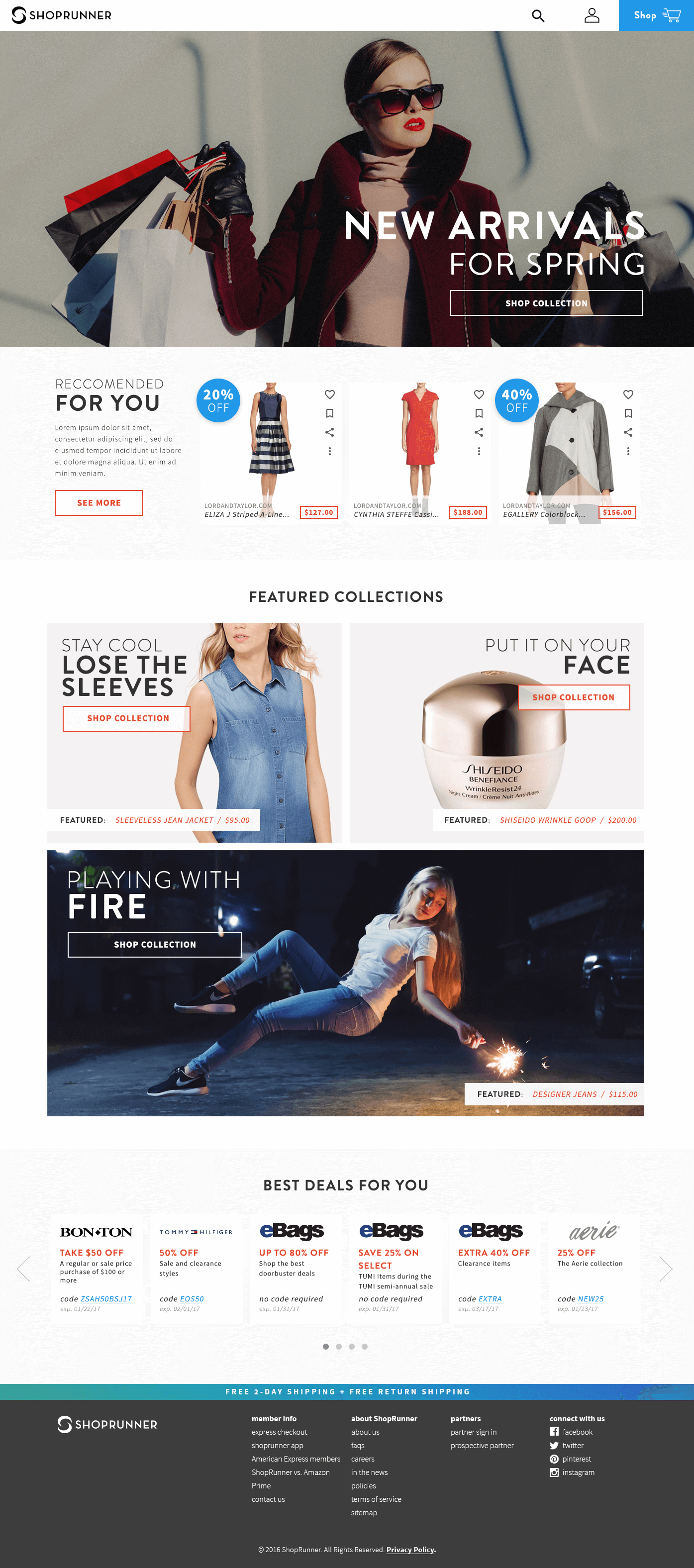
ShopRunner Web Redesign, Member Home Page
Member Experience
The existing ShopRunner member experience had a low level of user engagement because there was very little interactivity for users to engage in. Beyond the ability to search all partner merchandise in on place, there really wasn’t much to do, and very little reason for users to return to the site.

ShopRunner Web Redesign, Universal Product Tiles
Product Tiles
In an effort to craft a more robust and engaging experience, I introduced the concept of a universal Product Tile that would be a standardized way to display product SKUs across all ShopRunner properties.
Each Product Tile would offer the same basic interactive functionality:
liking a product (public), bookmarking (private), sharing a product on social media and other potential options like ‘show me less like this.’
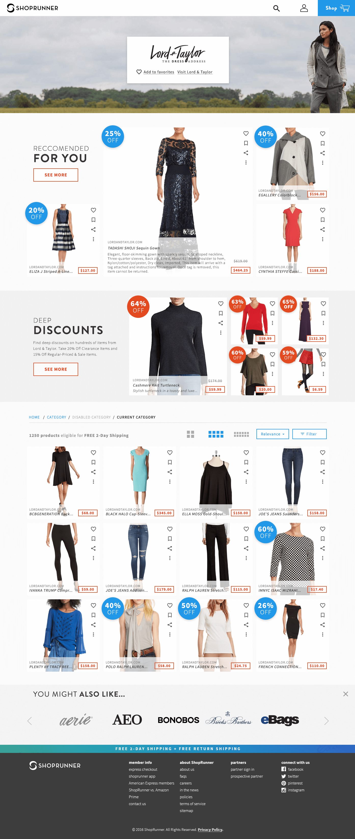
ShopRunner Web Redesign, Merchant Landing Page
Member Experience (contd.)
Smart Recommendations
With this level of explicit user feedback enabled for every product, ShopRunner would be able to surface smart recommendations for other products, brands and deals based both on browsing activity and actual purchase and return history. The ultimate goal would be to create a recommendation engine that would effectively learn each user’s behavior and offer meaningful personalized recommendations that got better the more they interacted with the system.
This would turn ShopRunner into an organic destination for discovery of curated shopping content, encouraging engagement beyond the final transaction itself by enabling users to share and connect with each other on the ShopRunner platform and across social media.
Because smart recommendations are pulled from all partner products in the ShopRunner network, this would naturally encourage in network cross shopping, as well as provide a robust dataset on user preference and buying habits within the network.
Partner Integrations & Welcome Email
Partner integrations and the Welcome Email series would be reworked, based on the same responsive framework, styleguide and general visual treatments as the rest of ShopRunner’s online presence. This would help give users a clean, consistent, mobile-friendly and trustworthy experience both on and off partner websites.
ShopRunner Web Redesign, Partner Integration 'learn more' modal
ShopRunner Web Redesign, Welcome Email
ShopRunner Web Redesign
Year: 2017
Client: ShopRunner
- Walker Design Did:
- Product
- UX
- UI
- Visuals
- Logo
- Webdev